Prompt Guide
How to Use Color Palettes in AI Image Prompts
Learn how to guide color palettes in AI image prompts using simple, practical color language.
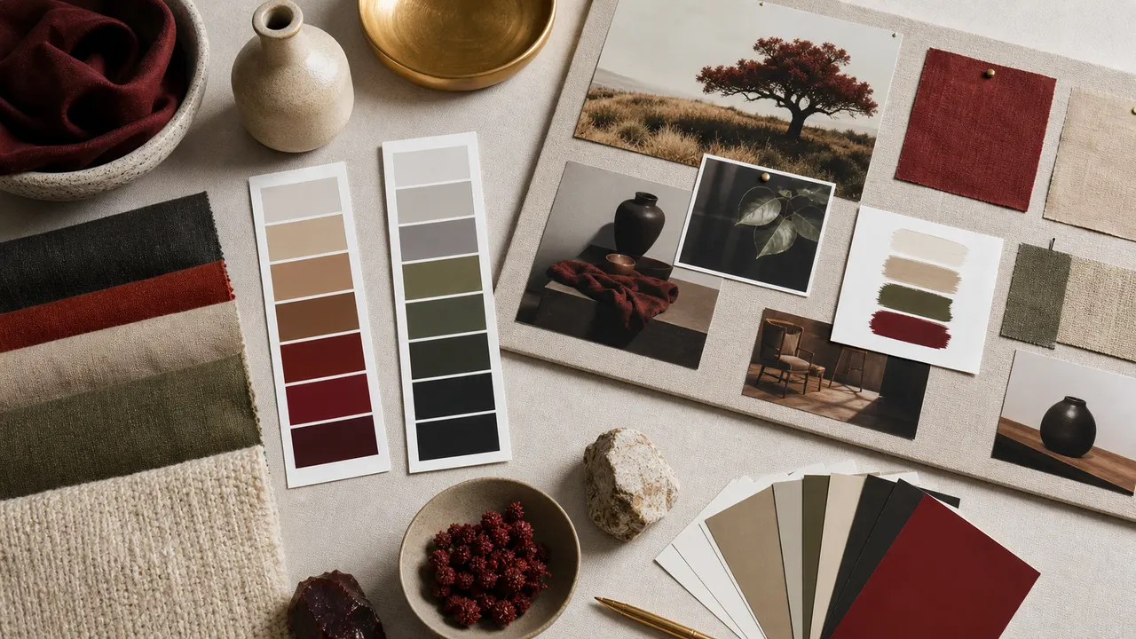
Color prompts work best when they define a small palette. Choose two or three main colors instead of listing every color you like.
Color affects mood, style, and readability. A clear color palette can make an AI image feel more controlled, even when the prompt is simple.
Start with the main color family. Common choices include warm earth tones, muted blues, soft pastels, deep greens, monochrome gray, black and gold, red and white, or faded vintage colors.
Then decide whether the colors should be bright or restrained. Bright colors are useful for playful illustrations, fantasy scenes, and stylized posters. Muted colors work better for realism, historical scenes, calm portraits, and cinematic images.
A useful structure is:
[main palette] + [accent color] + [saturation level]
Example:
muted earth tones with a deep red accent, low saturation, natural color balance
Accent colors are especially useful. Instead of making the whole image red, you can say red scarf, blue neon sign, golden embroidery, or green glass bottle. This gives the model a focal point.
Avoid asking for too many unrelated colors. A prompt that includes red, purple, green, blue, yellow, black, white, silver, and gold may produce a noisy image. It is usually better to choose two dominant colors and one accent.
Color can also support genre. Warm browns and soft golds fit cozy interiors. Blue and silver fit science fiction. Faded beige and gray fit historical or documentary moods. High-contrast black and red can create tension.
A practical prompt fragment might be:
limited color palette, warm beige and dark brown, small accents of brass, soft natural tones
Color prompts should guide the image, not overload it. Use them to create consistency across multiple images, product shots, character variations, or visual recipes.